Selected
Works
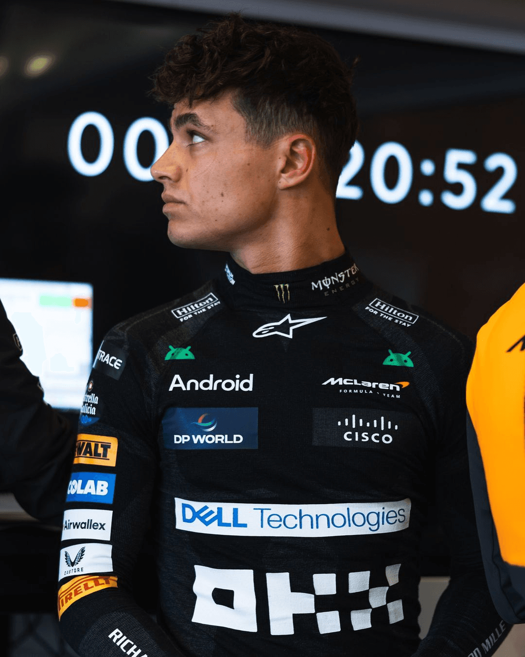
Android
Global Refresh
Android has 3.5BN active users, 12M developers and powers the Google ecosystem, but the brand itself was static, disconnected, corporate, increasingly invisible and losing share with GenZ.
We needed to go back to Android’s foundational values of freedom and inclusivity to reassert its future. Today we know people seek even greater autonomy and choice, especially younger generations as they build their own, connected ecosystems. We evolved the Android brand system to be more open and adaptive— moving with them across their connected world. The opposite of walled gardens, and rigid ecosystems.


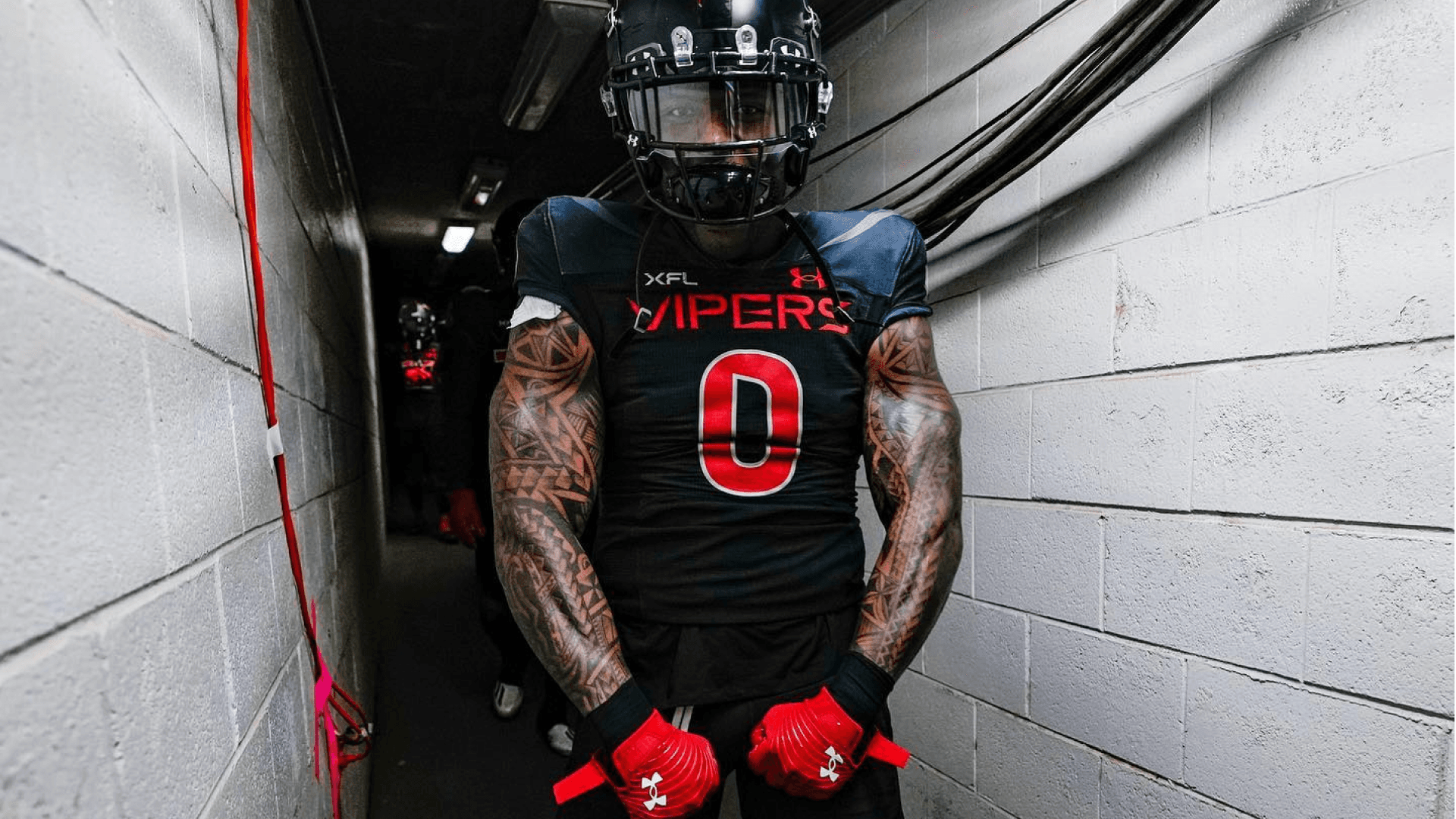
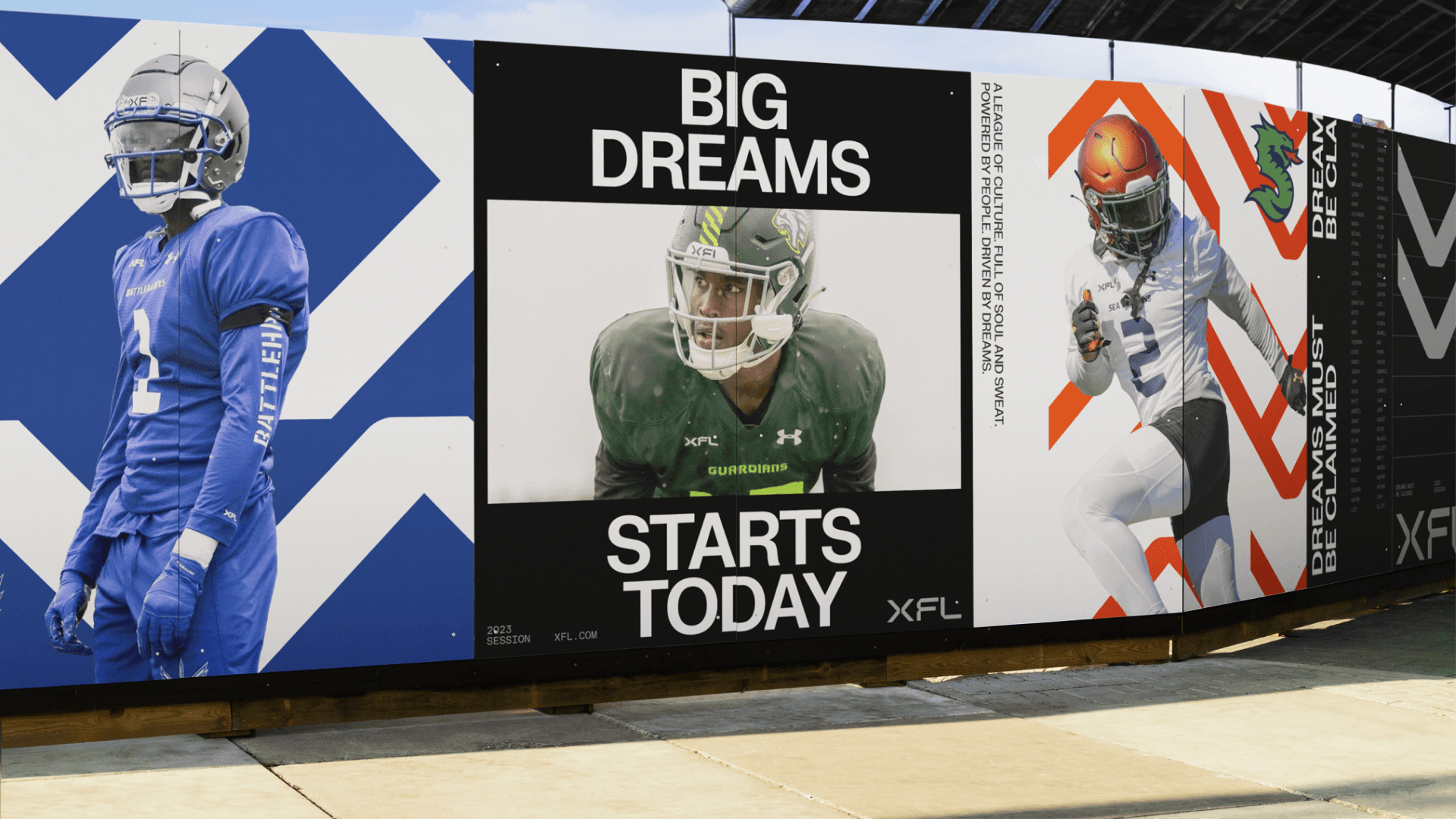
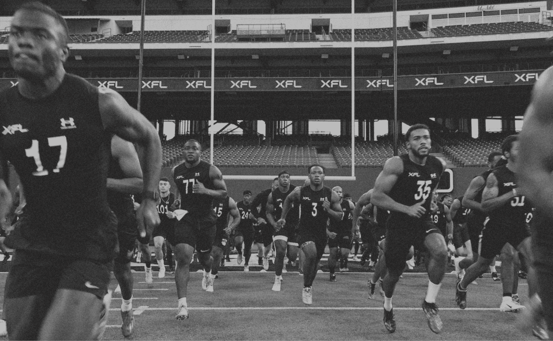
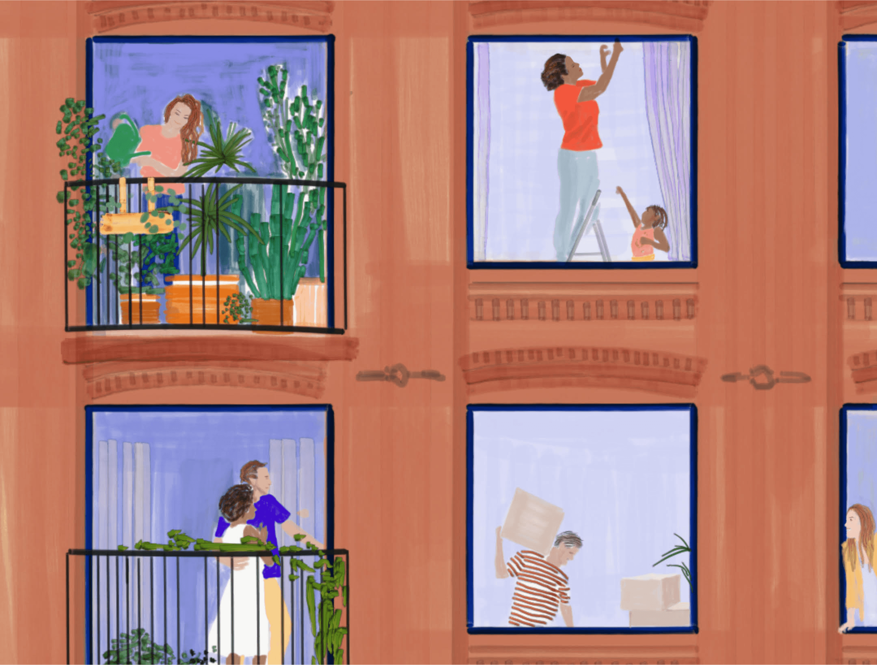
XFL
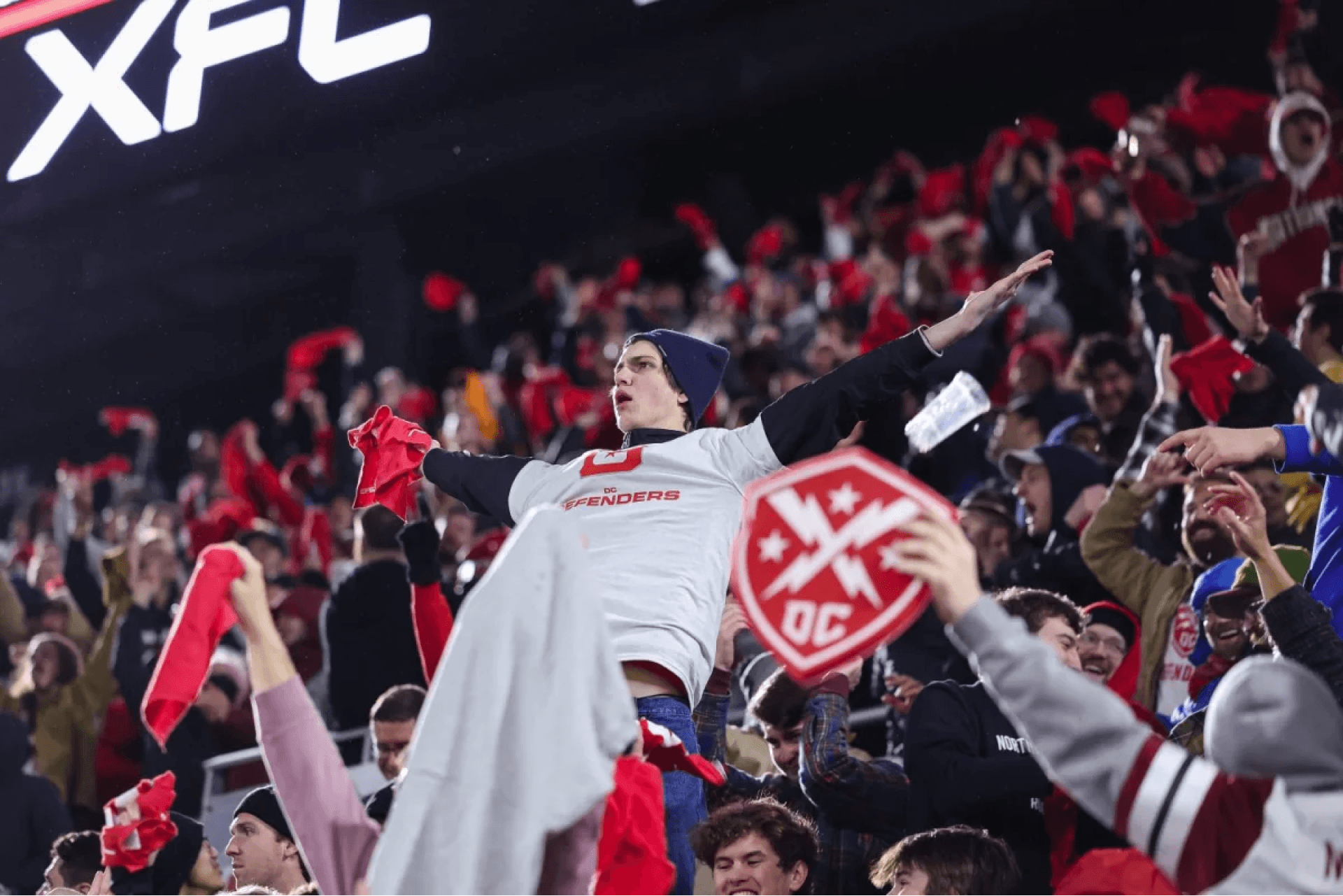
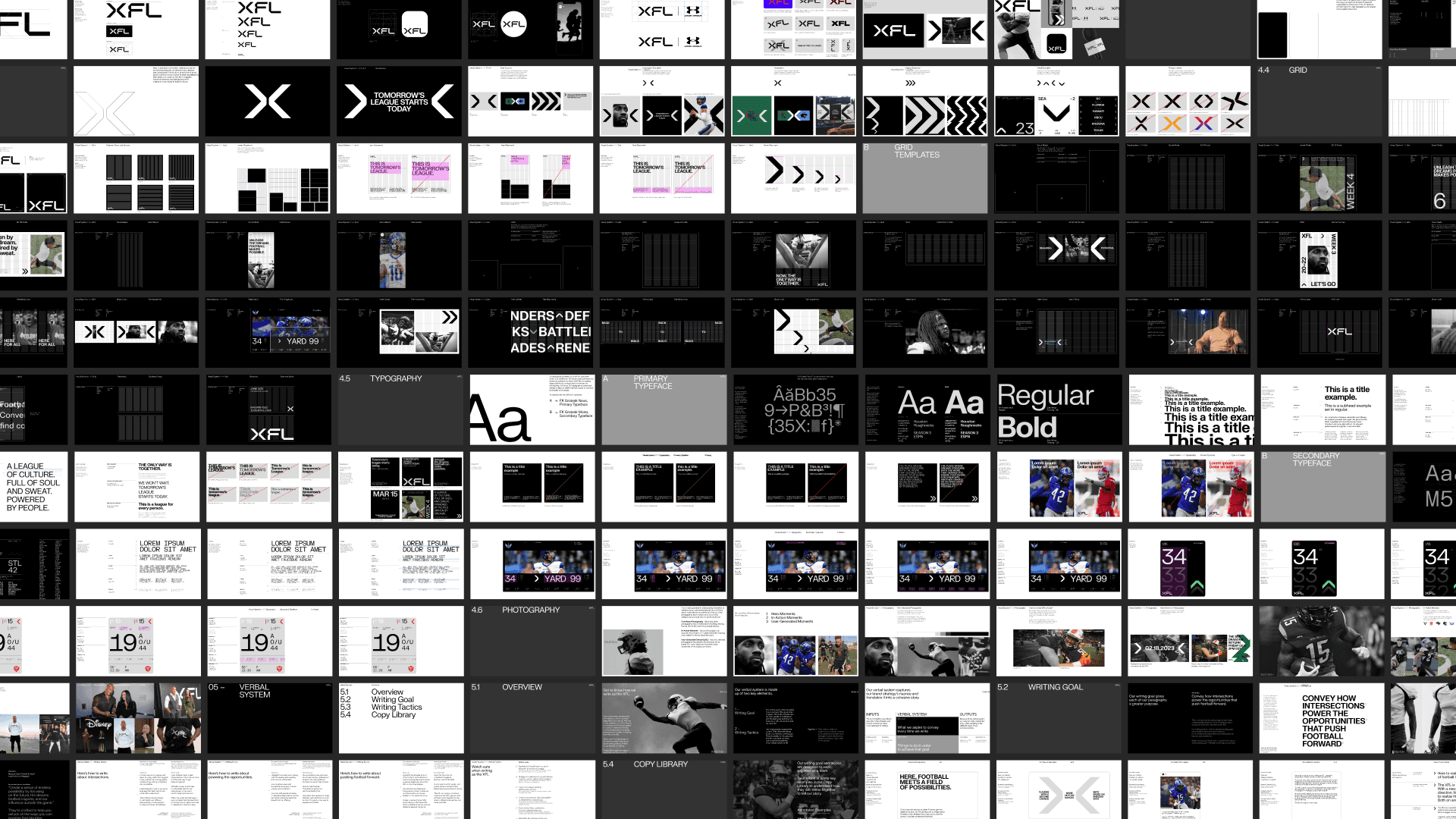
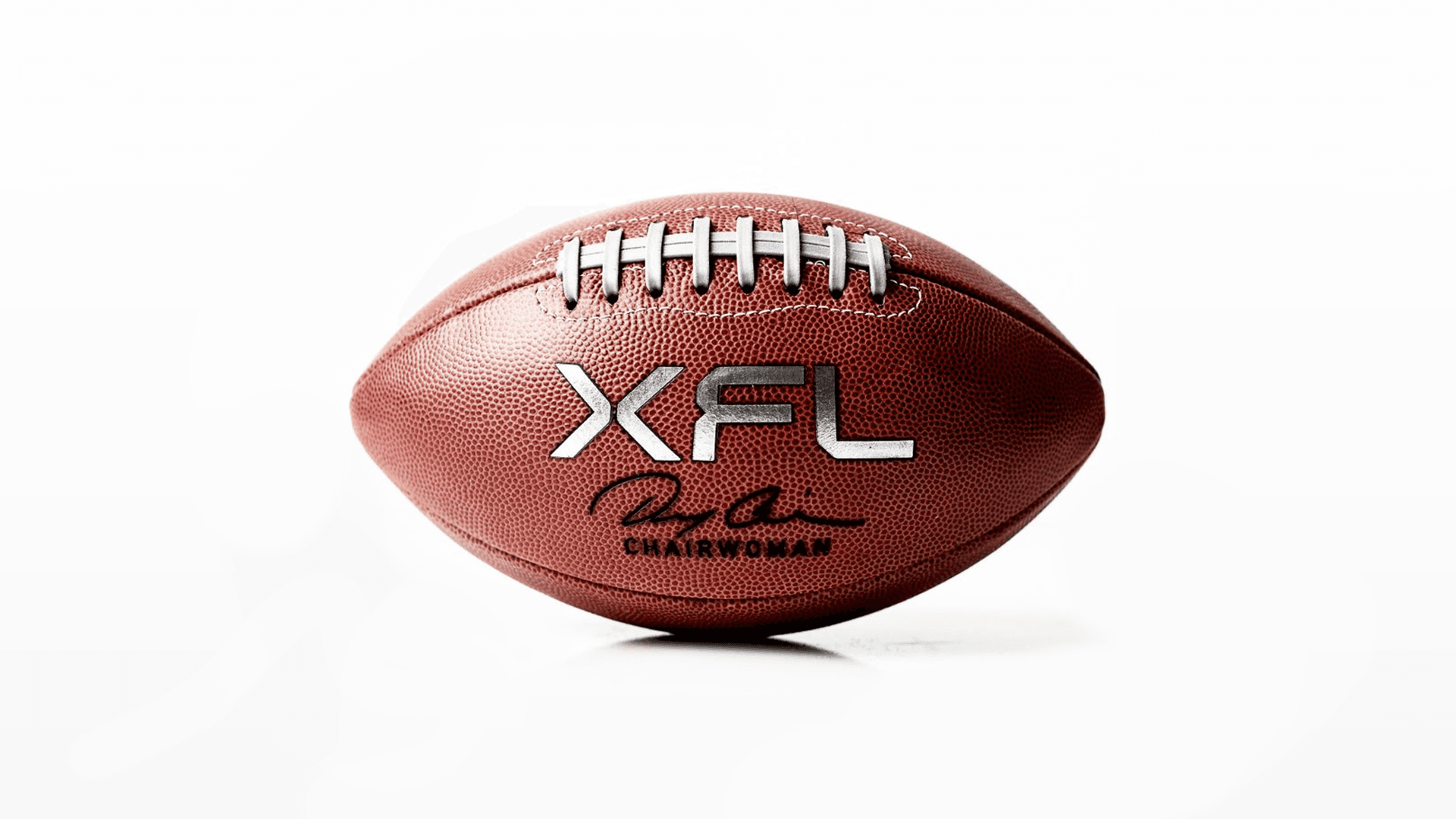
Across both iterations of the XFL, a bold spirit of innovation has been a common thread; however, it’s never had the chance to fully play out. In 2020, the league was acquired by Dany Garcia, Dwayne Johnson, and Gerry Cardinale of Redbird Capital with the vision to change the way people experience football. We designed an identity that matches the pace the XFL’s purpose sets. As the intersection of opportunity, the XFL is a league where all people, perspectives, and ideas can come together to push football forward. Our identity is modern, active, and inviting. Designed to ask questions, converge new experiences, and envision new futures—for the XFL and the world around it.


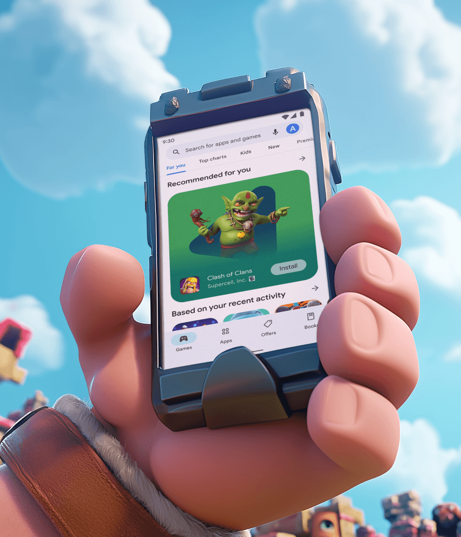
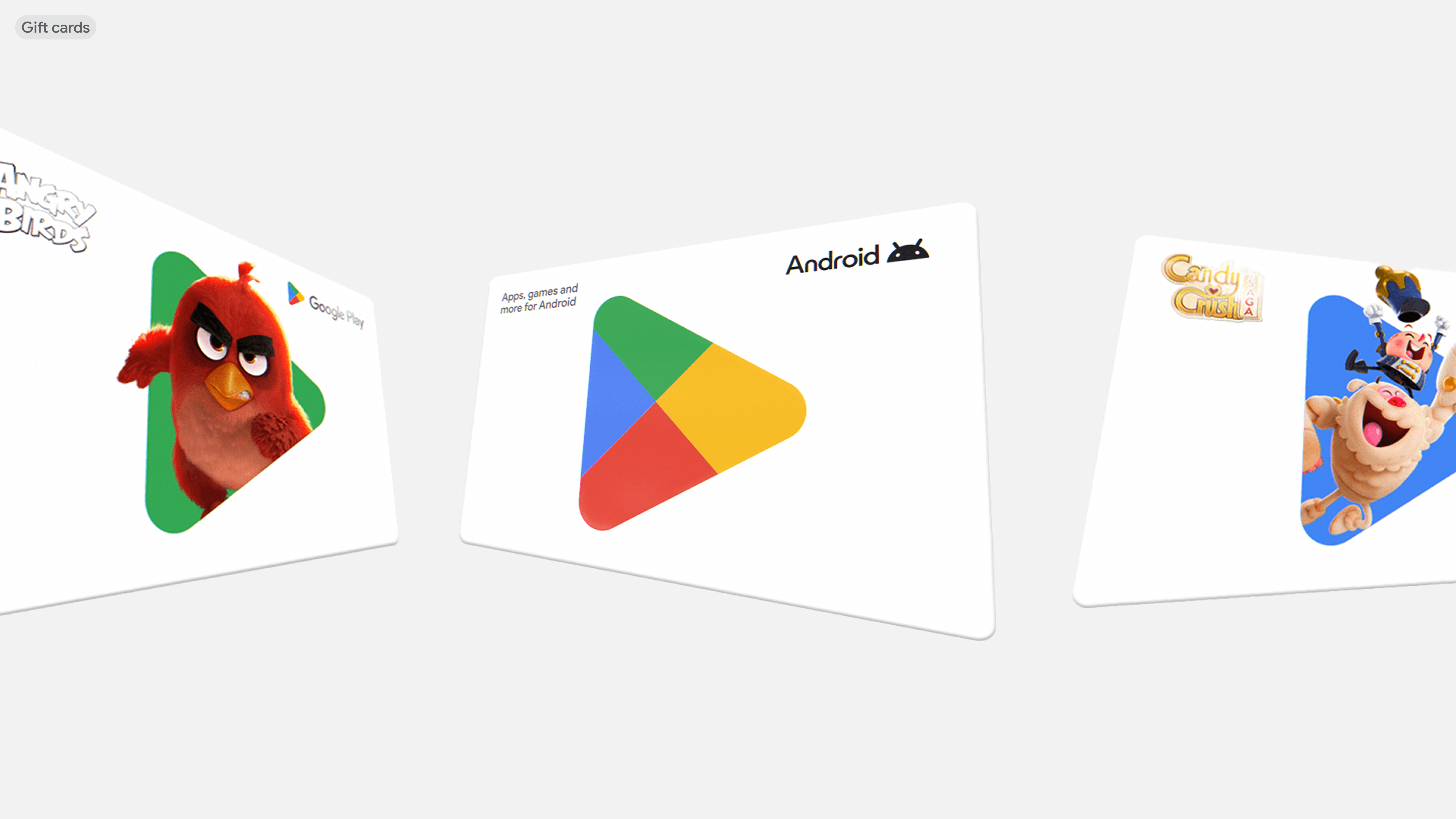
Google Play
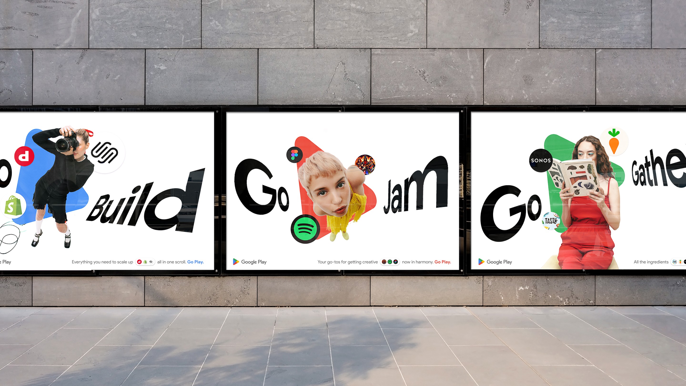
Branding the world’s largest marketplace to be less store, more Play.
Google Play is the world’s largest marketplace, with an unparalleled breadth of apps, games, and entertainment. However, with more options than ever for consumers, the brand didn’t help support “why Play” — it was passive, disconnected, transactional. We needed to prove Google Play was more than just a (super size) store — it could help you play.
We designed a new brand system for Google Play, uniting their full global ecosystem — across diverse IP and all the ways people engage with them. We transformed the prismatic logo into a navigator, activated through shape and behavior. It spins and rotates, helping cut through a sea of apps to take people straight to what they love.


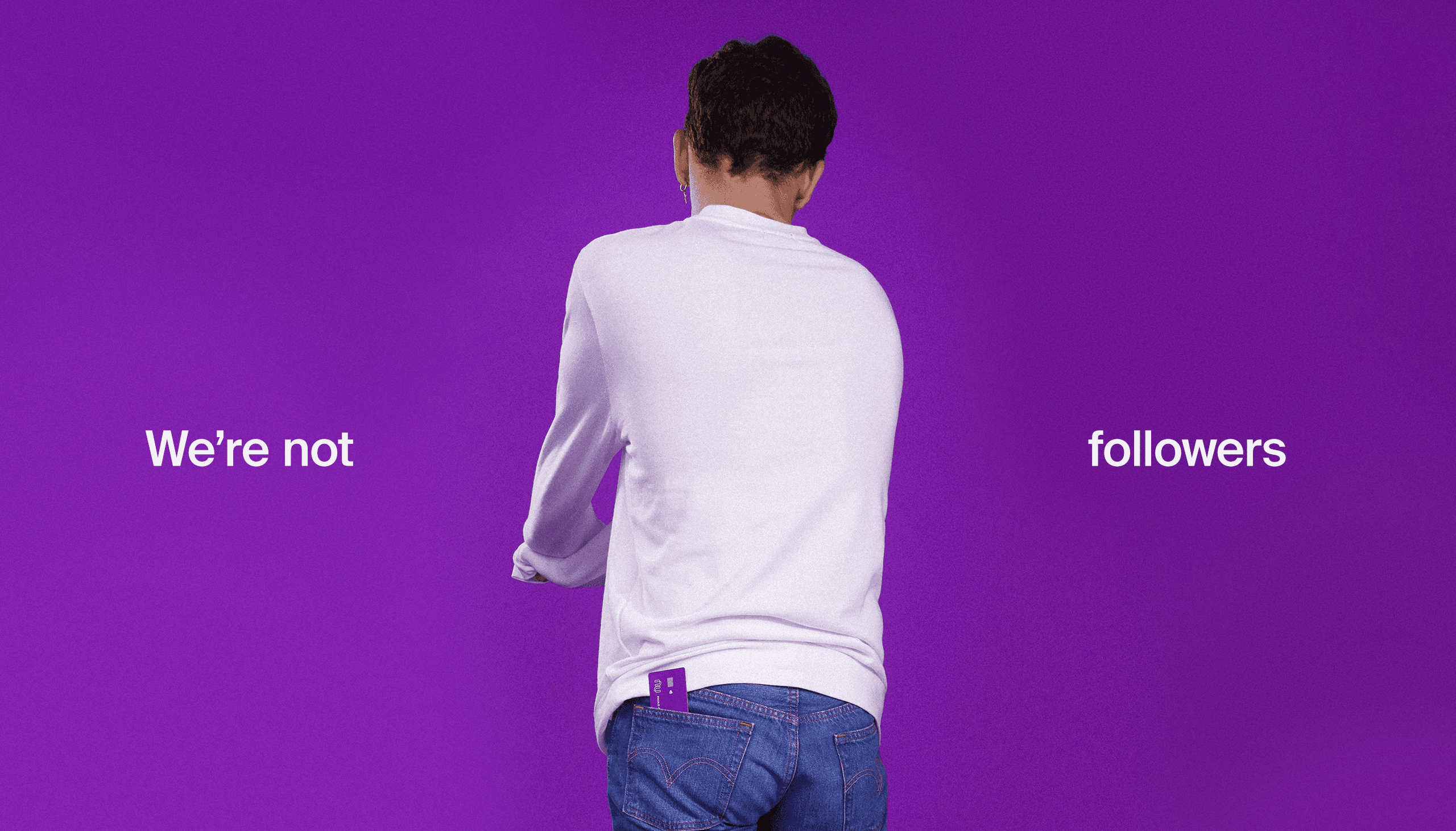
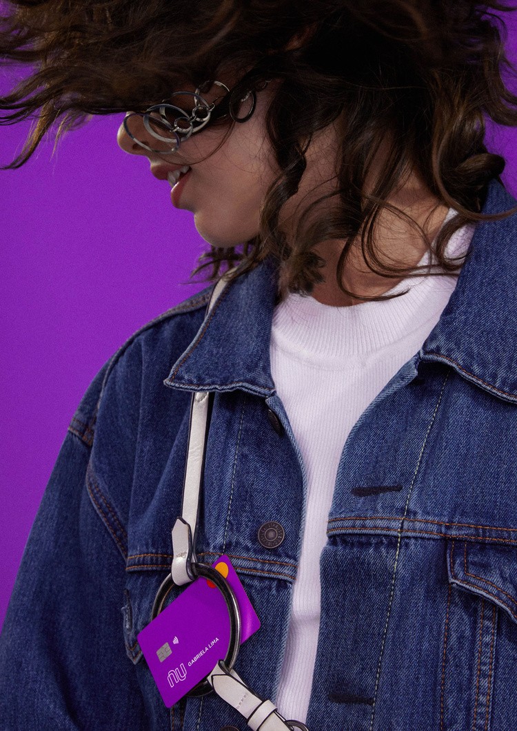
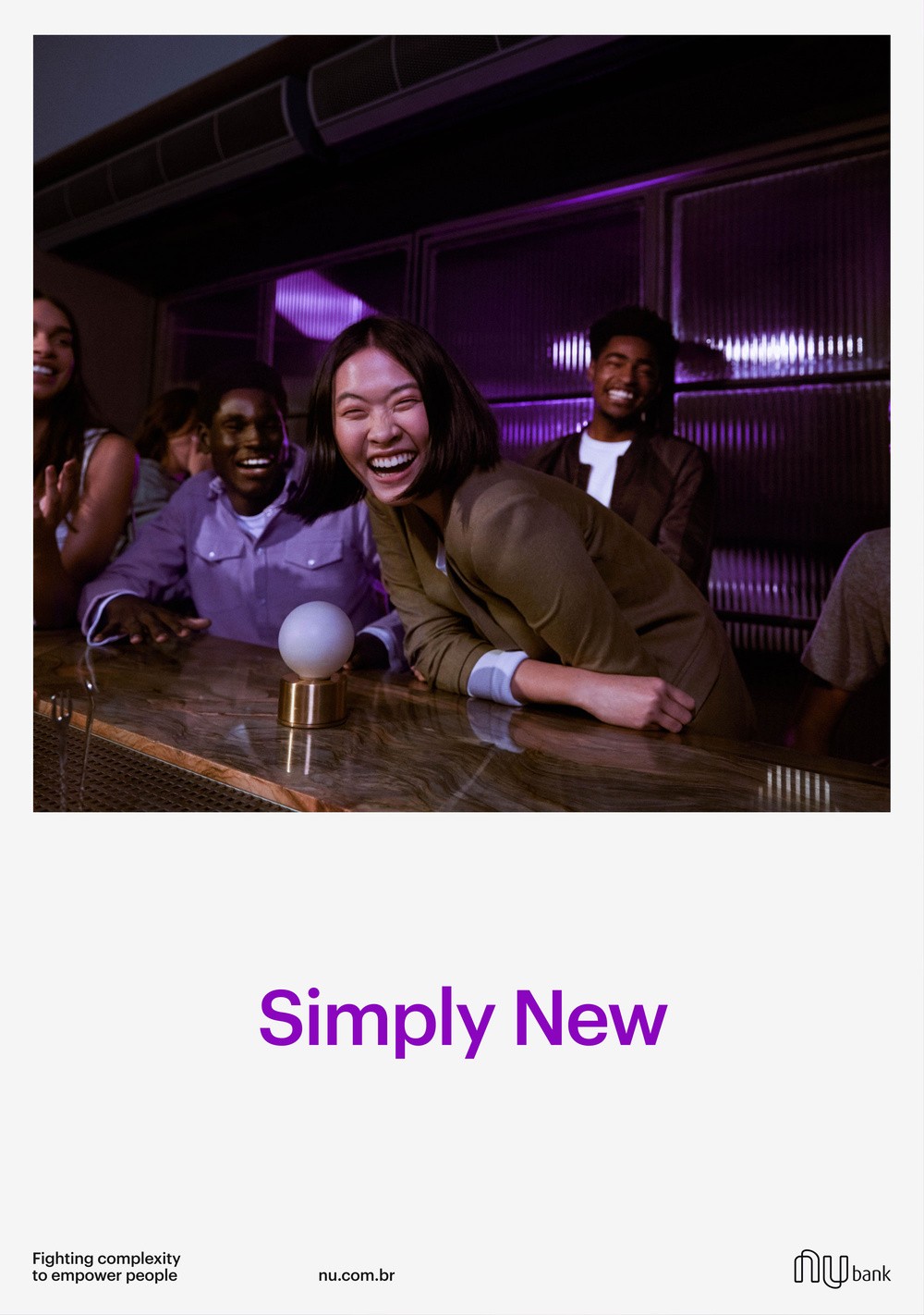
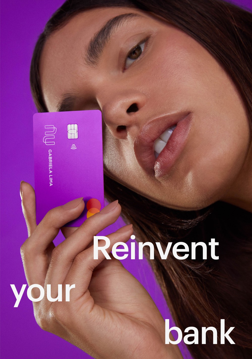
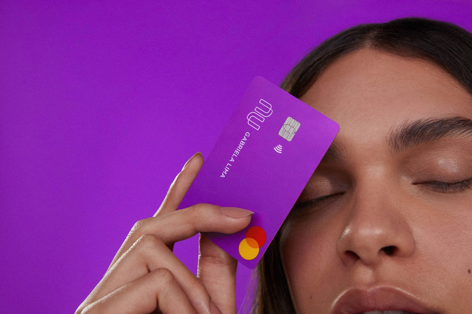
Nubank
During 2019 and 2020 we worked on Nubank's Brand System and the update of the brand assets. The main challenge was to buil a system that could guarantee consistency and scalability for a team that went from 45 to 100 designers of all disciplines (UX, graphic, motion, writers) in less than one year without cutting the creative possibilities and individual explorations of each one.


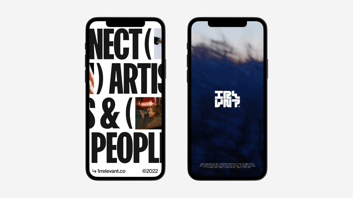
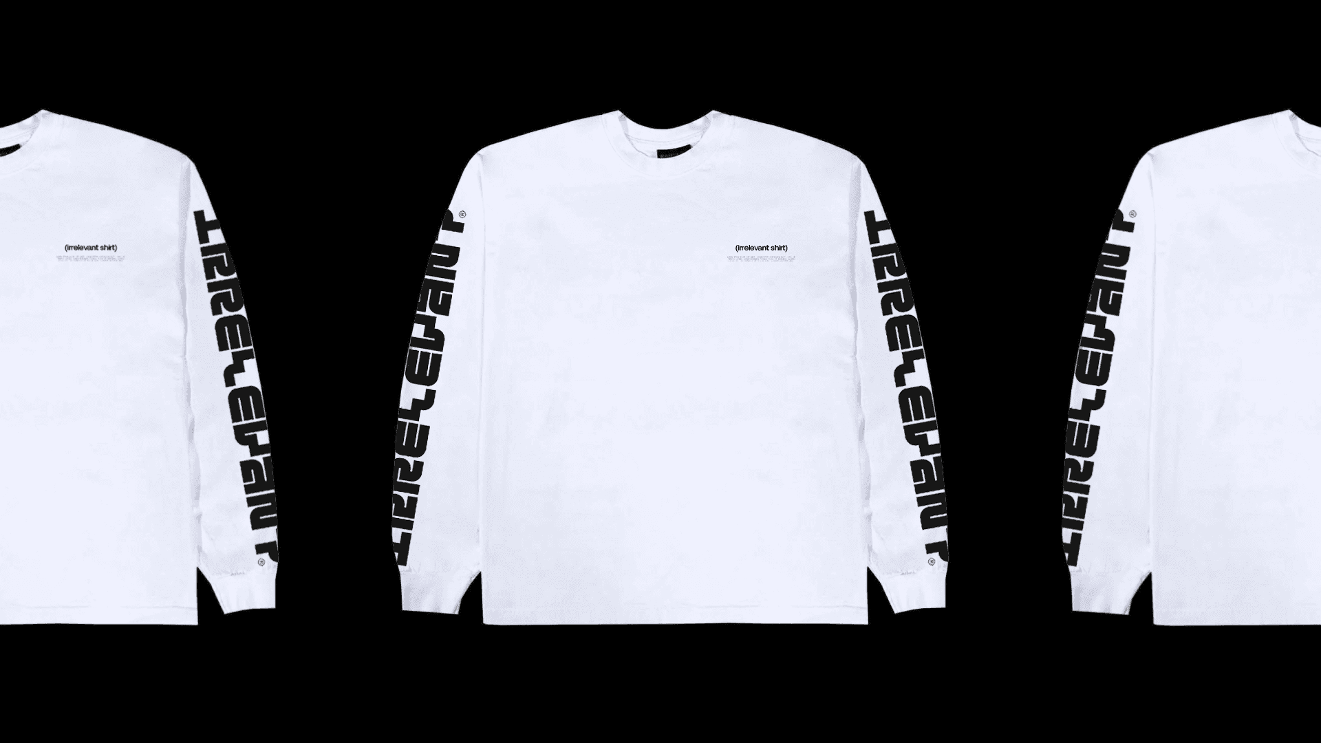
1RRELEVANT
Irrelevant is a creative studio that facilitates video clip projects
as an advertising platform for artists in the music world.


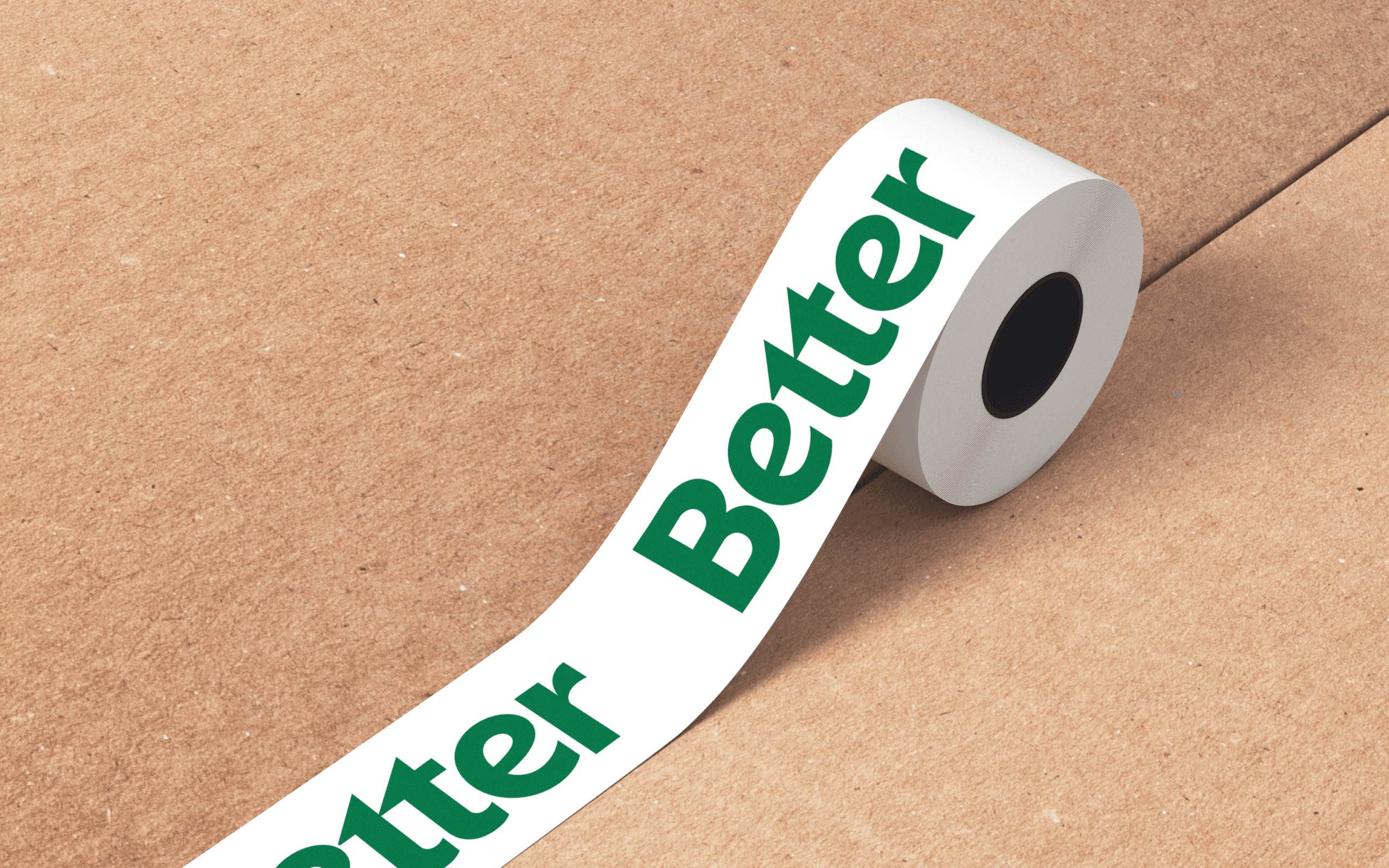
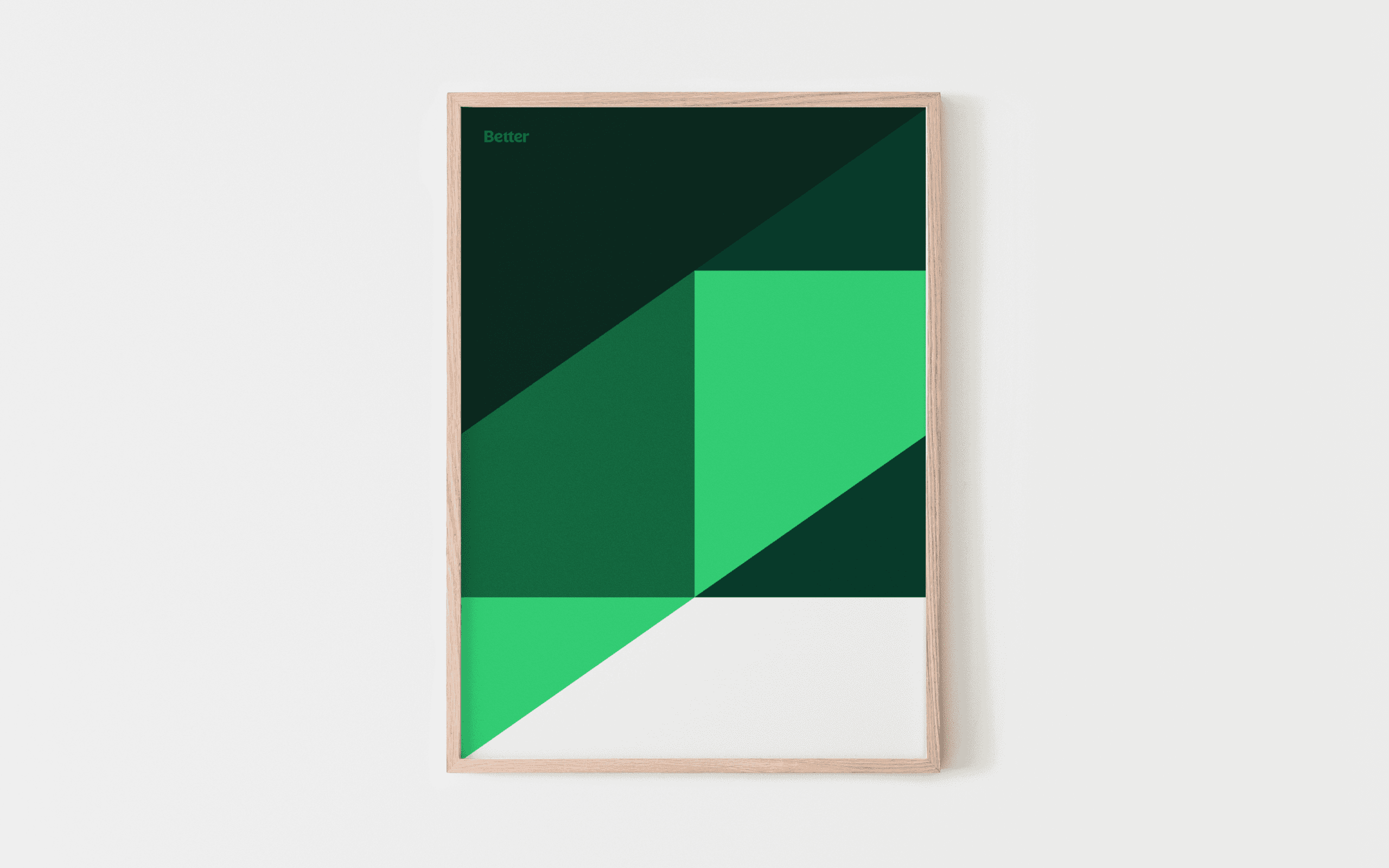
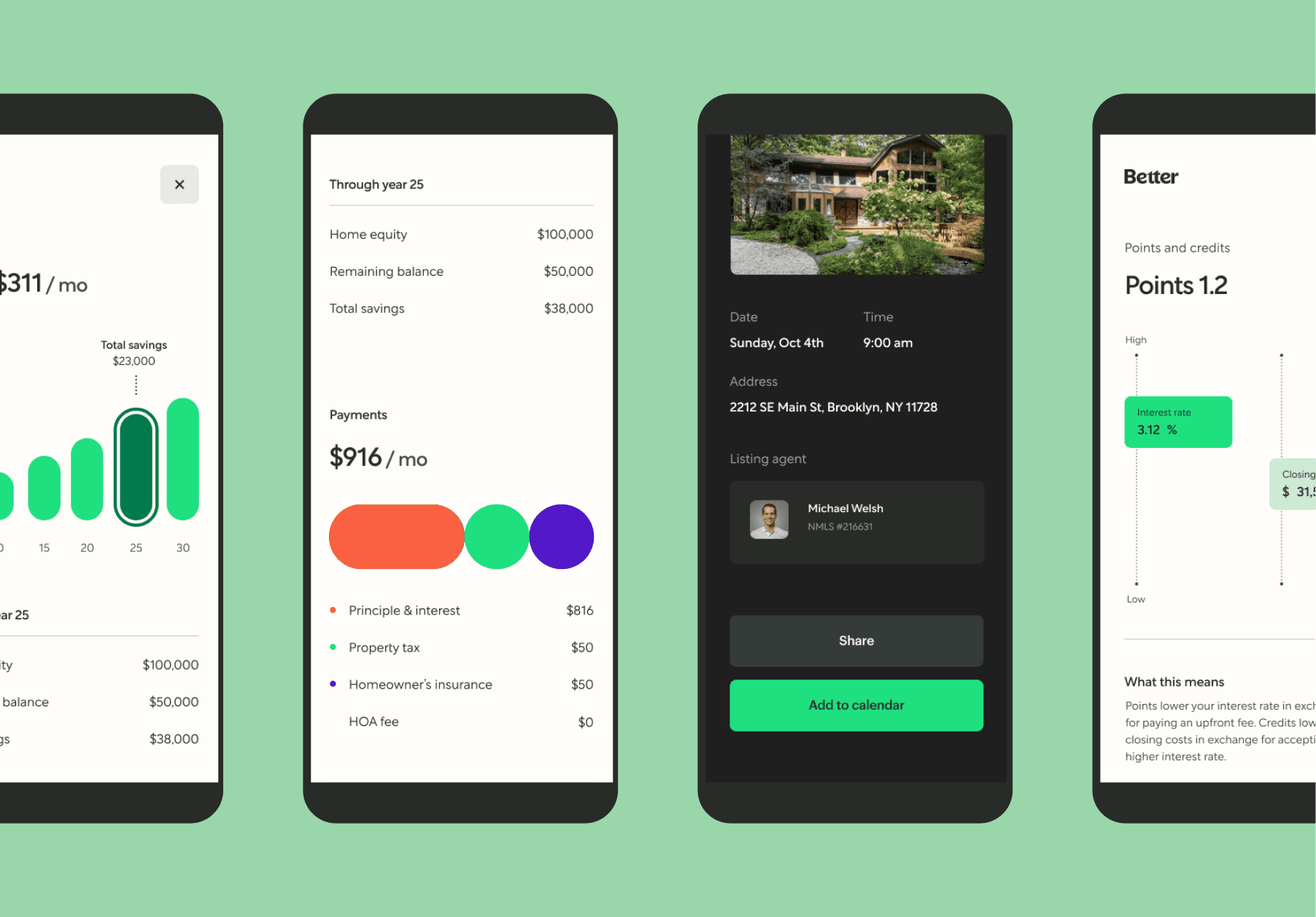
Better
At Better, the project focused on evolving the brand to better reflect clarity, trust, and momentum in a category defined by complexity and stress. Working across brand strategy, visual identity, and system design, the team reimagined how Better shows up across digital touchpoints—balancing financial rigor with a more human, approachable expression. The result is a flexible, modern identity system that supports scale while reinforcing Better’s core promise: making homeownership simpler, faster, and more transparent.


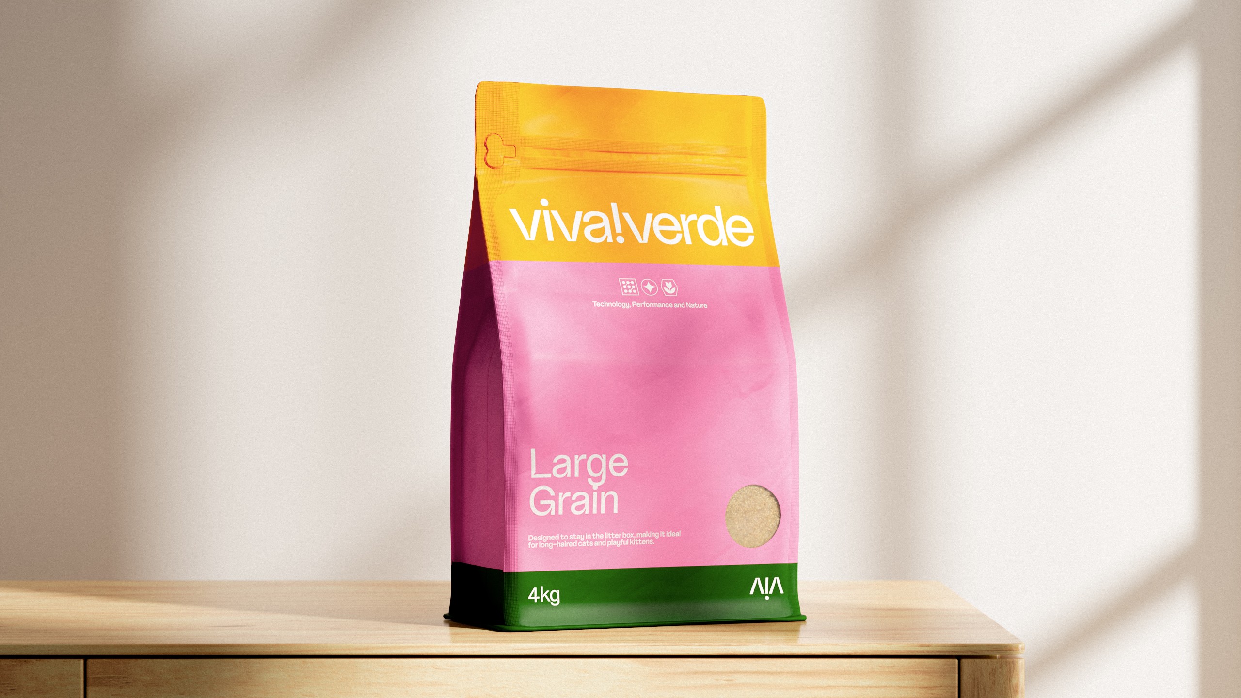
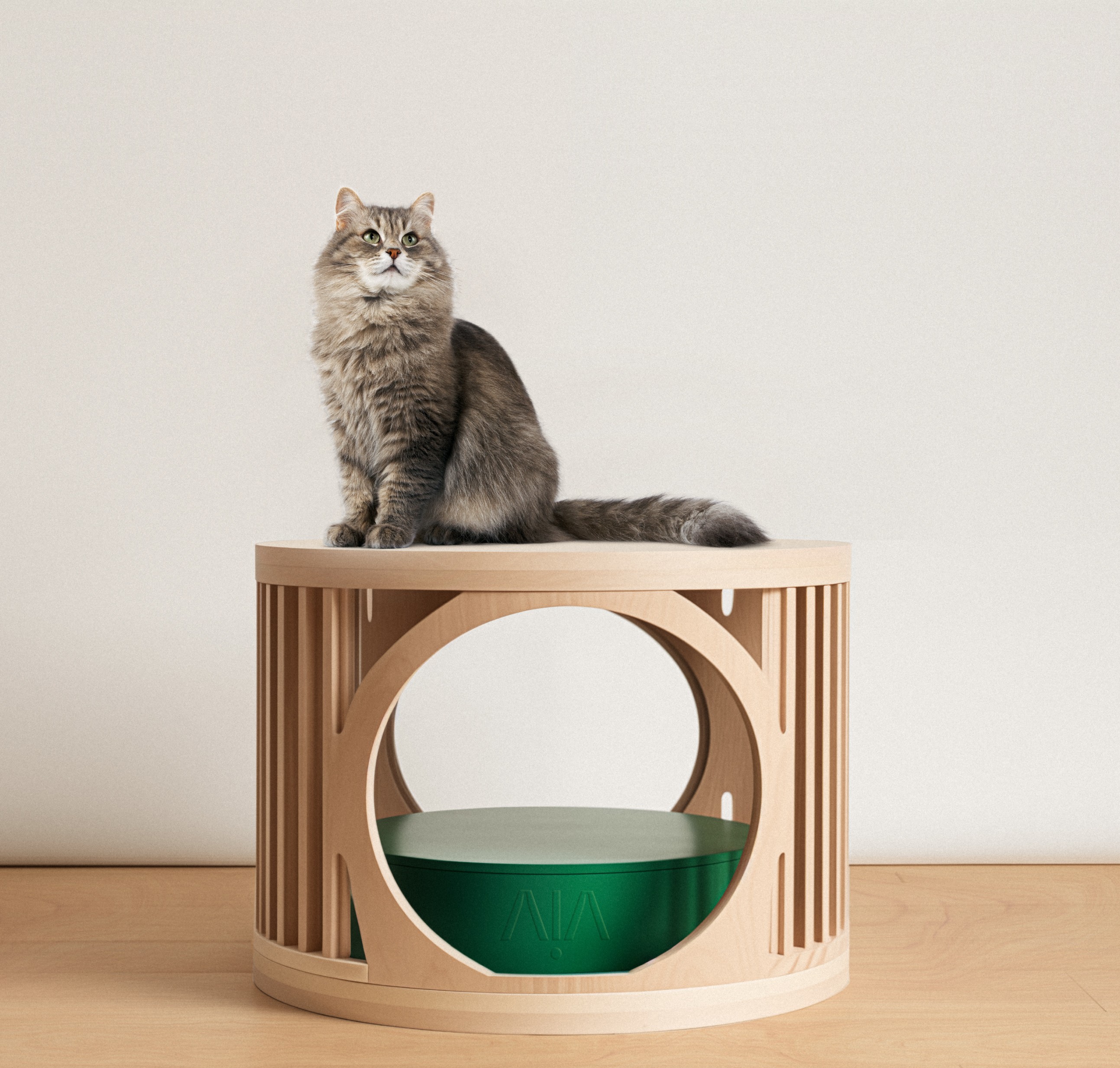
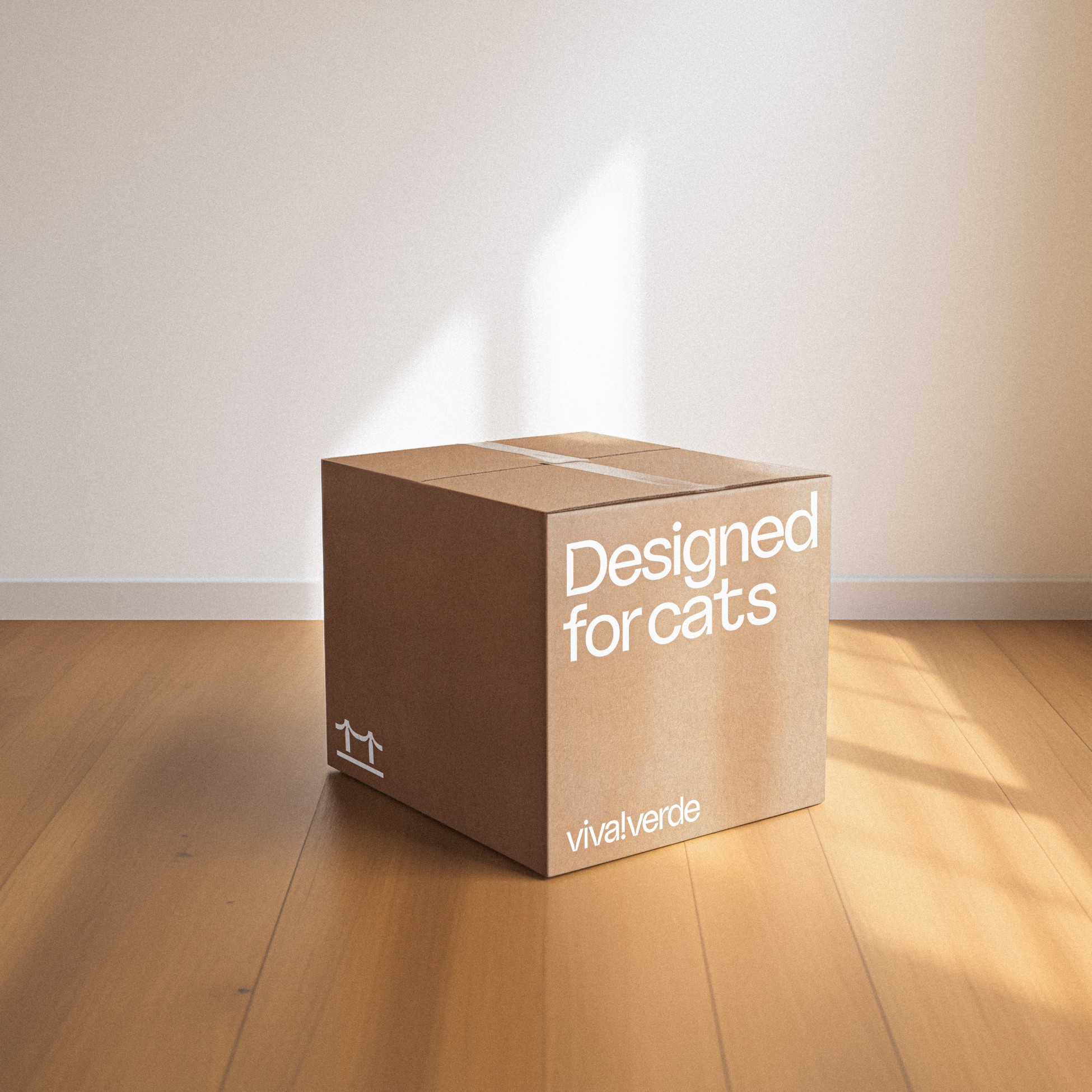
Viva Verde
Viva!Verde is a brand specialized in creating solutions that prioritize the health and welfare of felines. They work in synergy between what's best for the cat, convenient for the caregiver, and beneficial for the planet. Viva!Verde creates solutions that reach this intersection, guided by constant innovation and using technology inspired by the wisdom of nature. With high standards of quality and performance, they always seek to satisfy their most demanding audience: cats. Viva!Verde is the first genuinely cat-centric brand.
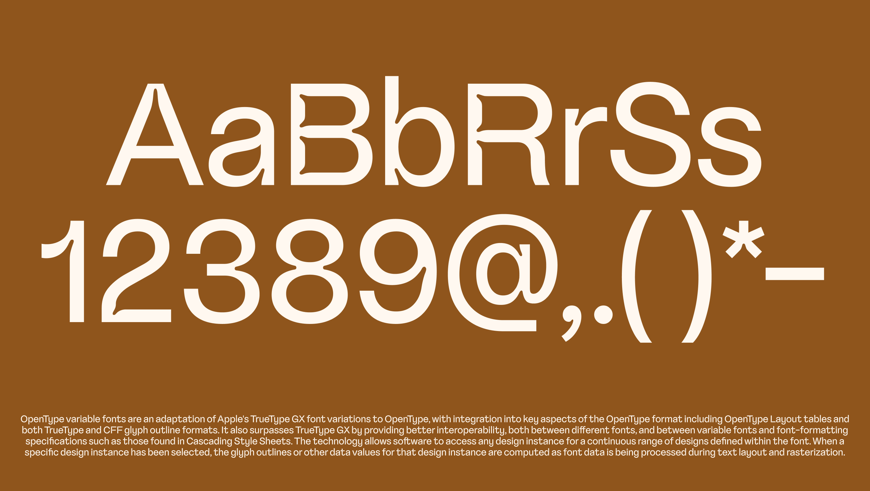
For their visual identity, we've designed a typeface that incorporates playful felines subtly hidden within the curves of each letter. This typeface is available in three unique weights, its ink traps were designed to mimic the elegant lines of cats. This results in a visual identity that embodies the spirit of a cat-centric company.